Improving Digital Order Fulfillment
Chick-fil-A One App
What is digital order fulfillment?
Digital order fulfillment is the time after customers place their order through Chick-fil-A’s app to the time they receive their order from the restaurant.
It’s the trickiest part of the whole experience because there are so many real-world, human variables.
My Role & Responsibilities
- User Research
- Competitive Analysis
- Brainstorming Workshop
- User Interface Design
- User Testing
My Team
- 1 UX Designer (Me)
- 1 Product Owner
- 2 Business Analysts
- 1 Apple Engineer
- 1 Android Engineer
- 1 Quality Assurance Engineer
- 2 Back-end Engineers
How the feature came to us
Chick-fil-A doesn’t make your food until you arrive at the restaurant to ensure that everything is hot and fresh. Customers would place their order through the app and select “I’m here” button when they arrived. With this method, customers are not seeing any real-time value in ordering ahead when they end up waiting anyway. At that point they could have gone through the drive thru and gotten their order in the same amount of time. What ended up happening was Customers would hit “I’m here” way before they arrived at the restaurant (like, immediately after placing their order) to so they could immediately receive their food upon arrival.
This created a lot of problems on the restaurant’s side. For Curbside orders we have a Chick-fil-A employee wandering around the Curbside parking spaces looking for a car that hasn’t arrived yet. For pick-up orders the food would sit on a shelf and take up room, and this was a big problem especially during the lunch/dinnertime rush when there’s no shelf space to spare.
On the customer’s side, we couldn’t win. Either they had a large wait time or they checked in ahead of time and now their fries are cold. I still remember the review we received on the App Store recommending that “the UX designer who came up with this should be fired.” Thanks, dude.
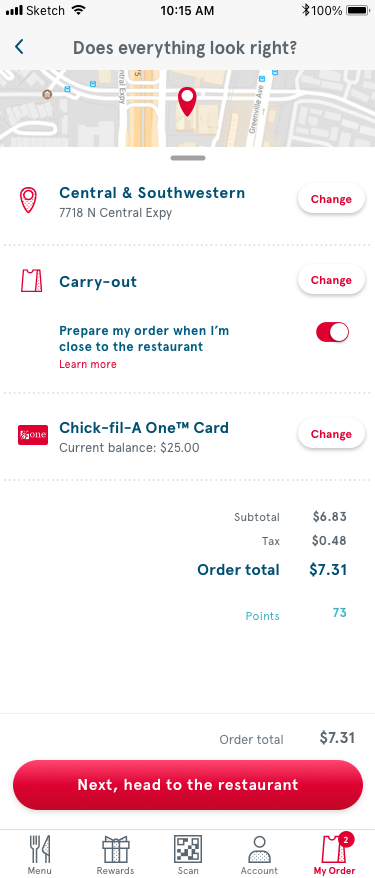
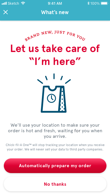
So we came up with Auto Check-in, a system where customers gave the app their location data and we could start preparing your meal ahead of their arrival and minimize wait times. Our goal was a “just in time” system where we accounted for how busy the restaurant was and how complicated your order was to adjust the geofence so your only wait would be the time it took to move the gearshift into park.
It was great in theory, but customers weren’t opting in.
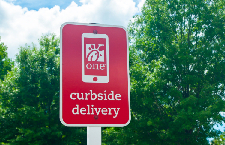
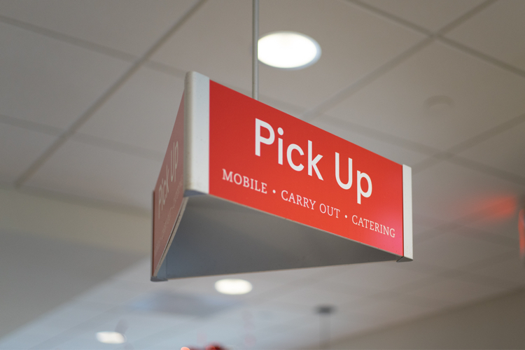
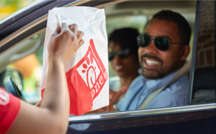
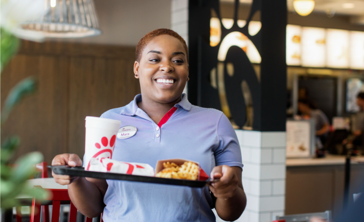
There are 4 ways customers are able to pick up their order:
Carry-out, Curbside, Drive-thru, and Dine-in.

The previous flow from the time you placed your order to the time it is ready to be picked up.
The research
Chick-fil-A has an account with usertesting.com, which allowed me to send out screens from the original flow and receive feedback from a large pool of users in about 10 minutes. I screened users to ensure that they were familiar with the app and had placed at least a couple orders digitally.
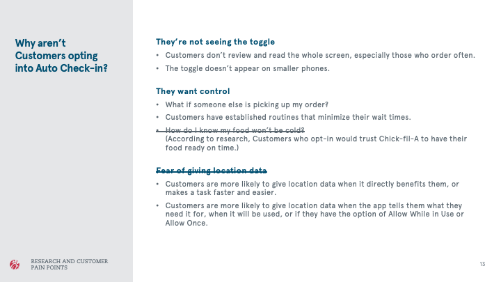
The user test revealed 2 main issues. Control was a big one. When it comes to food, customers aren’t messing around. They want to make sure their food is hot, first of all, but what if someone else is picking up the order? I can’t be close to the restaurant when my husband is picking up the order on his way home from work.
The second issue was a misstep between the company and actual real-world use. If you have a toggle called “Auto Check-in” I can sort of guess what that means, but because I want control I am definitely not going to turn it on and leave it to chance. The toggle we previously had was at the end of a list, too, so many users with smaller phones weren’t seeing it.
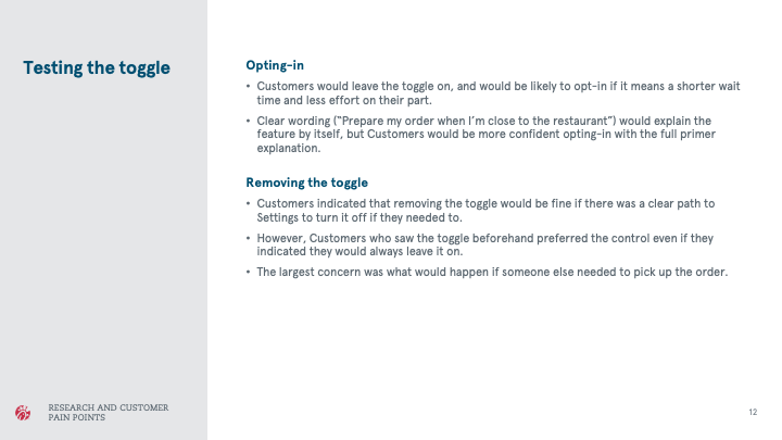
However, when testers saw screens with plain language and a more visible toggle, they were confident and sure. All of them said they would be likely to turn it on.
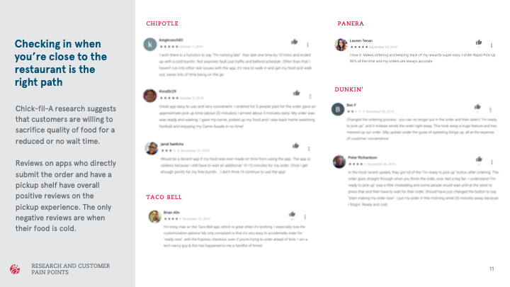
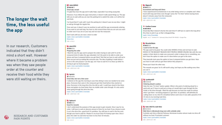
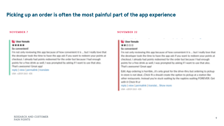
I also conducted research for the Chick-fil-A app and other apps using the reviews on the Apple Store and Google Play, and it looked like no restaurant was doing a very good job when it came to the delivery portion of the experience.
The design sprint
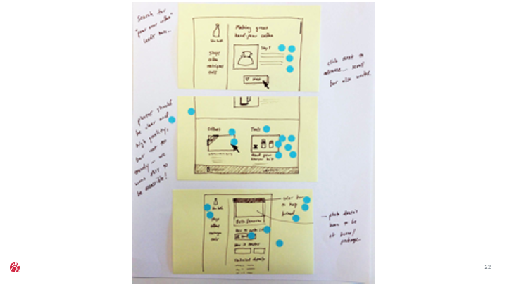
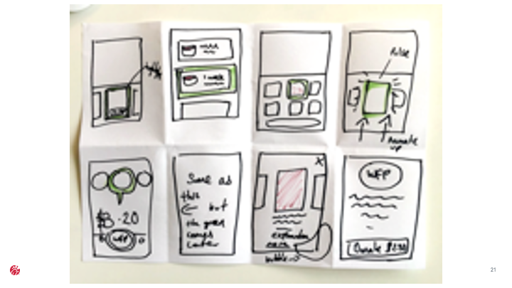
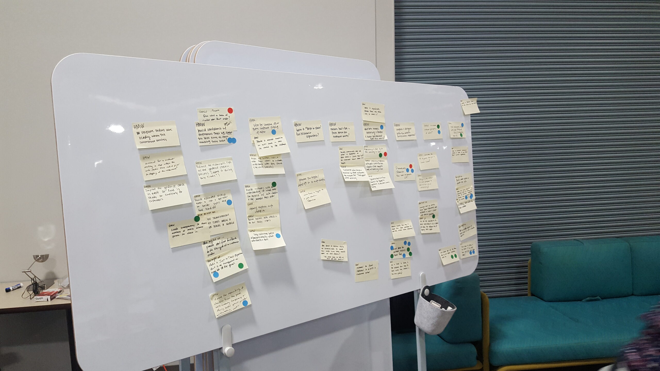
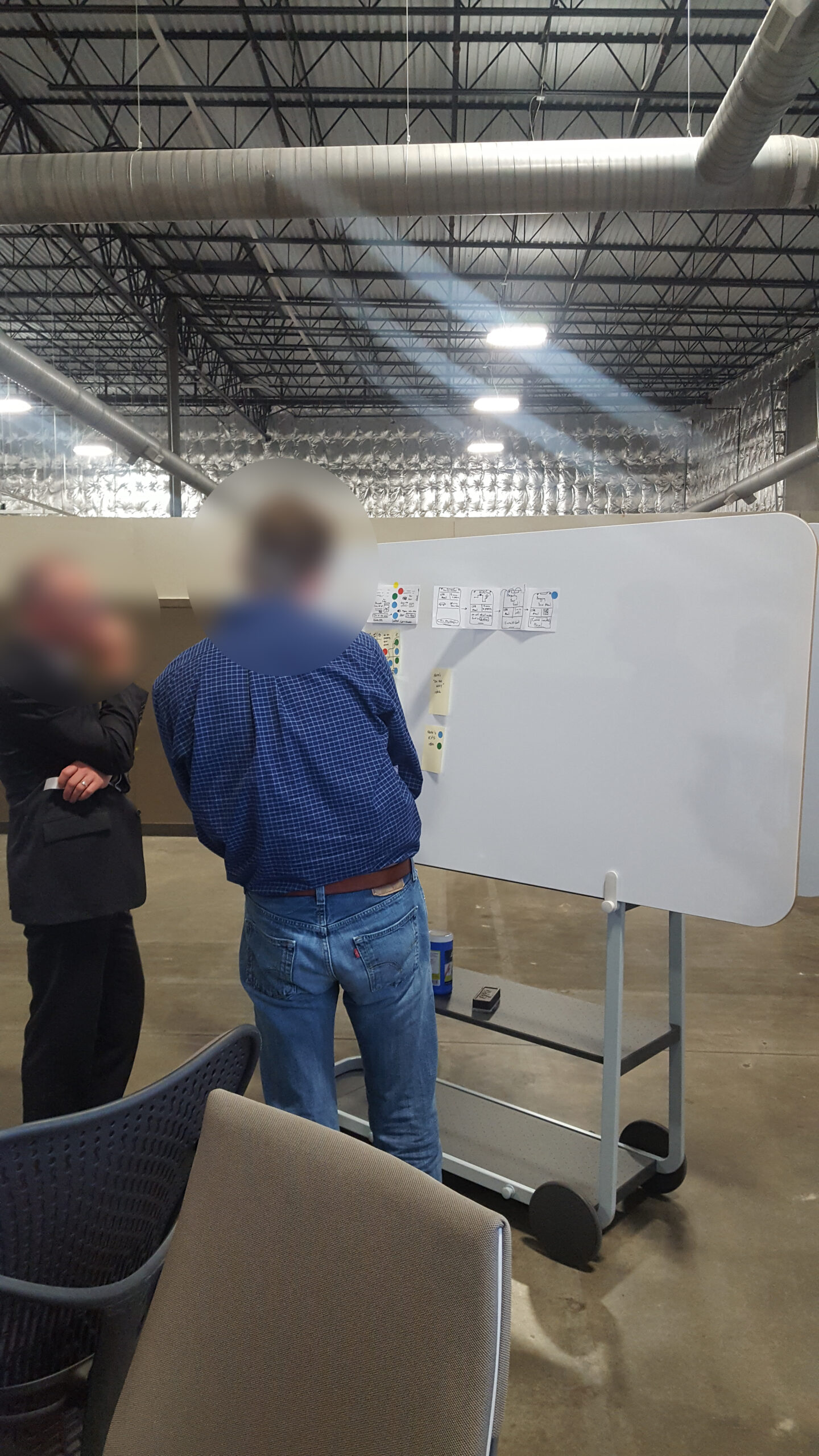
I led a 2 ½ hour design workshop which included the entire scrum team of 8 people (excluding myself) and the design director responsible for all of Chick-fil-A’s digital customer experience.
Our goal for the design sprint was to ensure the entire team was on the same page and that we all understood the root of the problem, and brainstorm solutions.
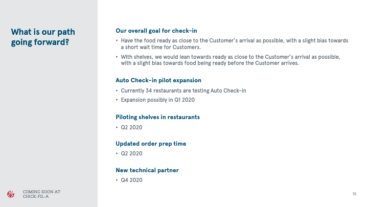
In order to ensure everyone was on the same page, I presented the research I conducted from usertesting.com, and included screenshots from app store reviews for Chick-fil-A’s app as well as other fast food ordering apps. I presented our goals and timeline for checking-in, in general, including physical improvements to the restaurants themselves.
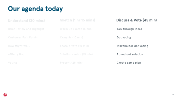
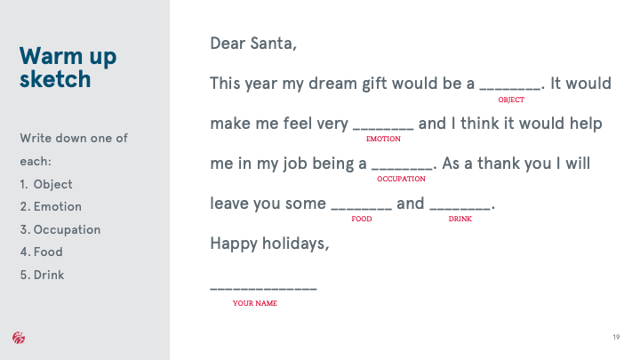
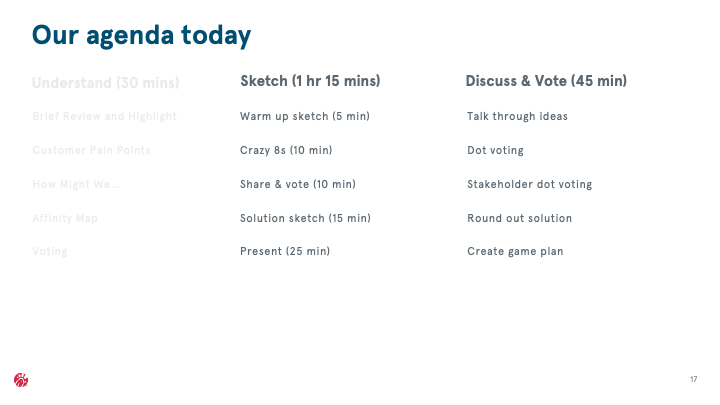
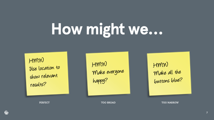
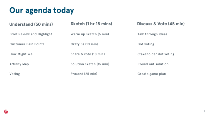
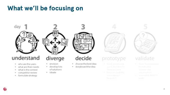
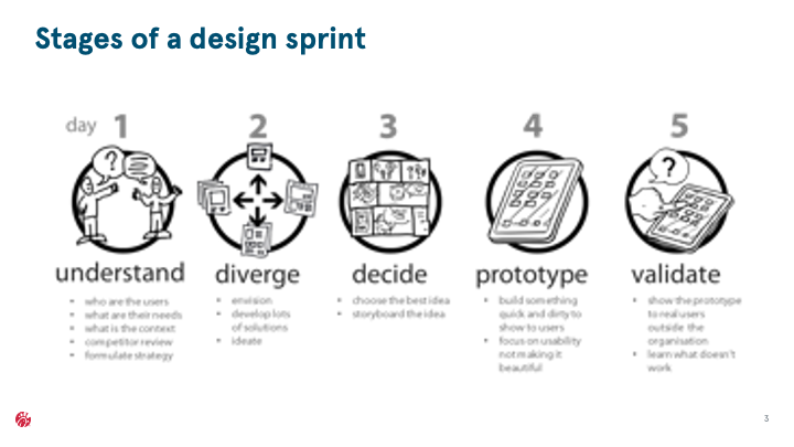
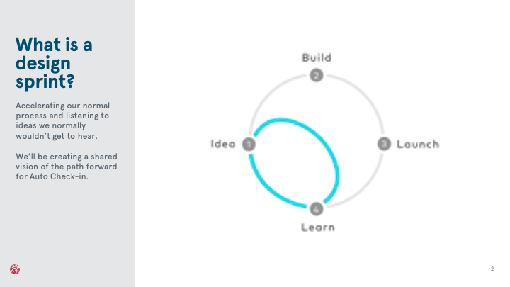
My slide deck for facilitating the workshop. I prefer not to make my slides bullet points, because no one wants to hear the speaker read verbatim off of a PowerPoint.
Our updated UI
I took the ideas from our design sprint and really put Auto Check-in at the forefront, given the benefits to both the customer and the restaurant.
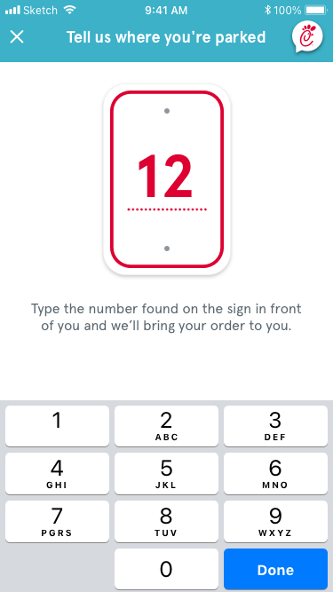
One of the things the design sprint highlighted was several flaws on the screens you see when you’re picking up the order. Given that you’re likely driving, the instructions on where to go and where to park are small, and those needed to be more at the top of the hierarchy on the page. I proposed new screens for these as well using drawings that we had dot voted on.

