A Better Way to Recover Unhappy Customers
A Better Way to Recover Unhappy Customers
Chick-fil-A: Spotlight
What is Spotlight?
Spotlight is one of Chick-fil-A’s internal tools used by Franchise Owners (Operators) and director-level members of an individual restaurant’s staff to stay connected to their customers. It’s a website of many hats, as restaurants use it to send rewards, resolve complaints, send promotional emails, and view the restaurant’s engagement metrics. Restaurants use it as their primary day-to-day tool for customer engagement. It has thousands of users and helps make the restaurants money by drawing customers in.
My Role & Responsibilities
- User Research
- Competitive Analysis
- User Interface Design
- User Testing
My Team
- 1 UX Designer (Me)
- 1 Product Owner
- 2 Business Analysts
- 2 Front-end engineers
- 3 Back-end Engineers
- 2 Quality Assurance Engineers
Abstract
CARES tickets at Chick-fil-A are customer praises or complaints. The location can see, respond, and offer a reward through Spotlight for customer retention but this process was unintuitive and lengthy if many came through in a day. I spoke to many Operators and Marketing Directors on what their ideal experience would be and they all wanted to keep all the relevant information on a single page. We already had some APIs from other teams that we leveraged and ensured through design and usability testing that our new designs exceeded the expectations of our customers.
How the feature came to us
When a Chick-fil-A customer wants to complain or praise a restaurant, they will enter a CARES ticket. These tickets will appear under the Recover tab on Spotlight for the Operator or Marketing Director to view and, where appropriate, call the customer to apologize for their experience and/or offer a free reward to ensure they aren’t soured on that particular Chick-fil-A location.
We received a disproportionate amount of complaints from Spotlight-users on the Recover tab.
The research
I spoke with a dozen Marketing Directors and Operators to find out what it is they don’t like about the current experience, and identified a few main problems.
I have to leave the page often. When users clicked on a complaint they have to go to one website to view the complaint, another website to view the customer’s receipt to ensure they actually bought what they said they bought, a page elsewhere on Spotlight to see if this person visits my restaurant often and what they usually order to make sure I’m offering them an appropriate award.
I can’t track this person’s resolution. There is no place for notes, so some customers are called twice or offered multiple rewards because no one knows who is doing what without talking in person.
I can’t track patterns in my restaurant. If all the complaints are happening during one shift or the same type of complaint is happening more often than not, that’s a failure of the restaurant and something that needs to be fixed. (One Marketing Director spent 4 to 6 hours each Saturday going through each complaint and filling out an Excel file to ensure that everyone was recovered and to see if there were any patterns.)
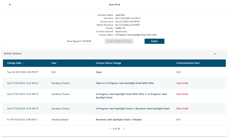
Previous desktop design
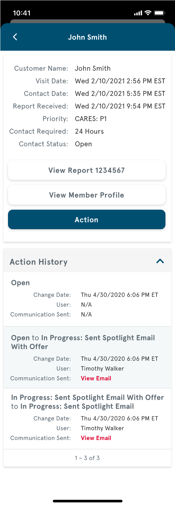
Previous mobile design
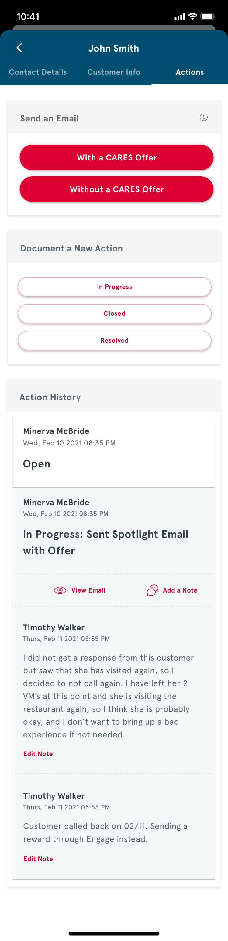
The new UI
On screen Sync Report
All the information about the complaint is displayed in context. We also link to any past complaints to see if there are patterns of Karen-type behavior.
______
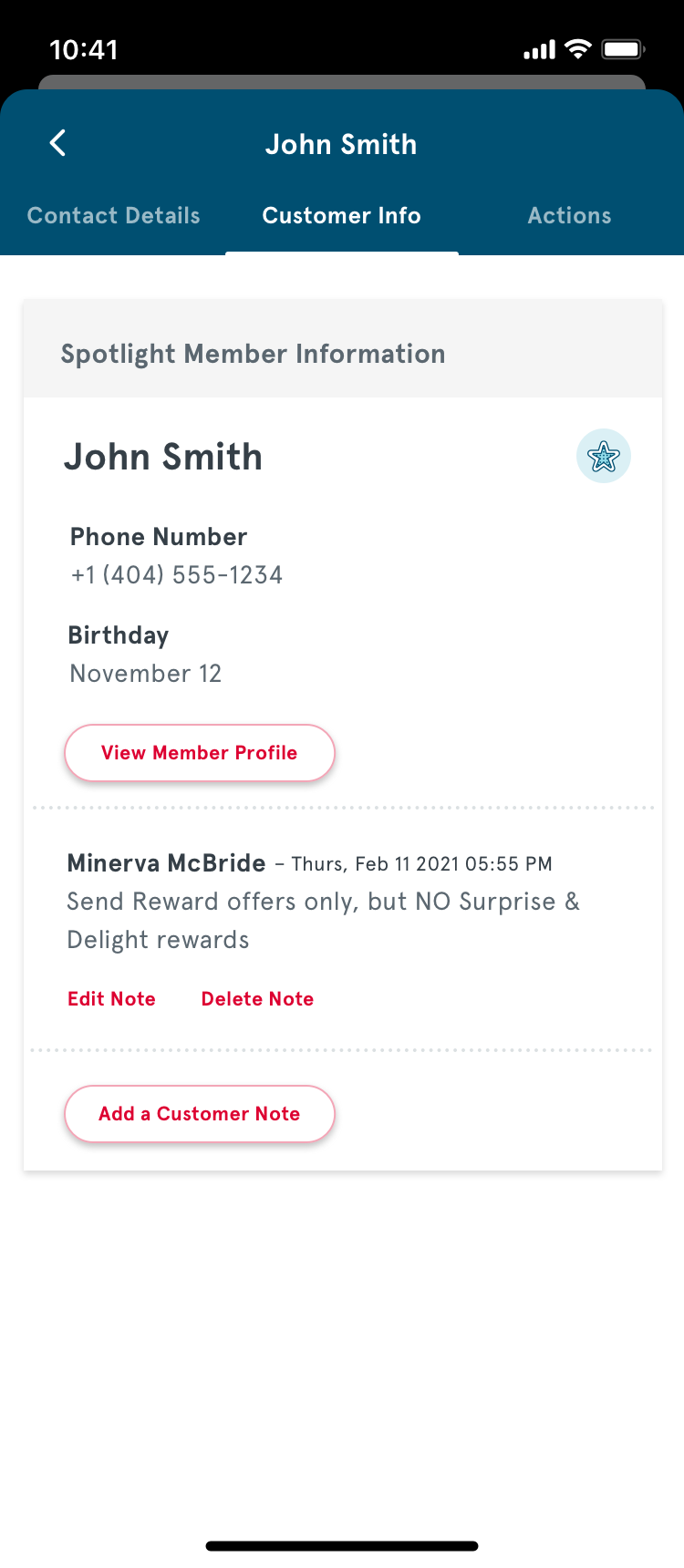
More member information
The existing screens displayed member information, but not their membership status. We also added a place for customer notes.
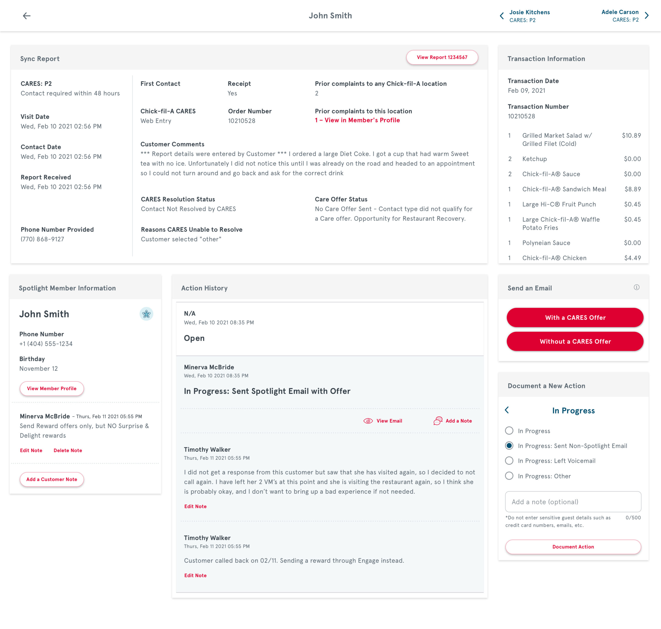
Easier navigation
Users can now navigate between different CARES contacts from within this page
________
On-screen transaction information
Users no longer have to go to a separate website to view the customer’s receipt, we use their API to load all of the transaction data
______
Notes
Employees can now add notes when they interact with customers so everyone at the restaurant knows what’s going on.

Usability testing
The reception to this was resoundingly positive. The user suggestions given for improvement were to include more automated data collection, which we addressed as part of a later project re-working the way we presented data on Spotlight.
Looking into the future
When a Marketing Director came to recover a complaint, I included a page where we would pull data from the customer’s profile to see which rewards they are most likely to redeem. This will help get them back to the restaurant to have a more positive experience in the future.
This was out of scope for the original designs, and was implemented after I left the project.
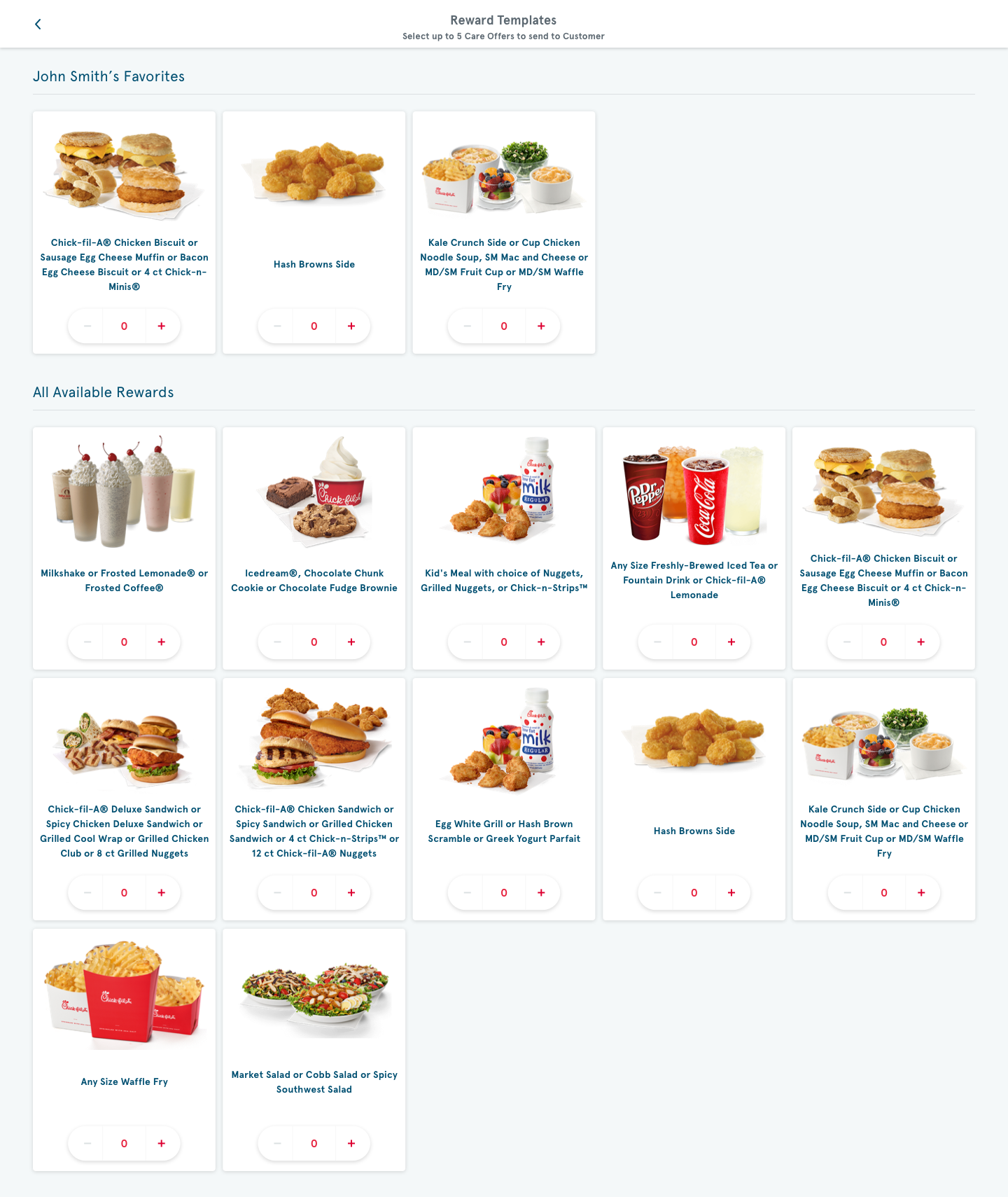
Future designs allowing us to use data to determine which Rewards would draw customers back to the restaurant


